Dashboard Design //
Data Visualization

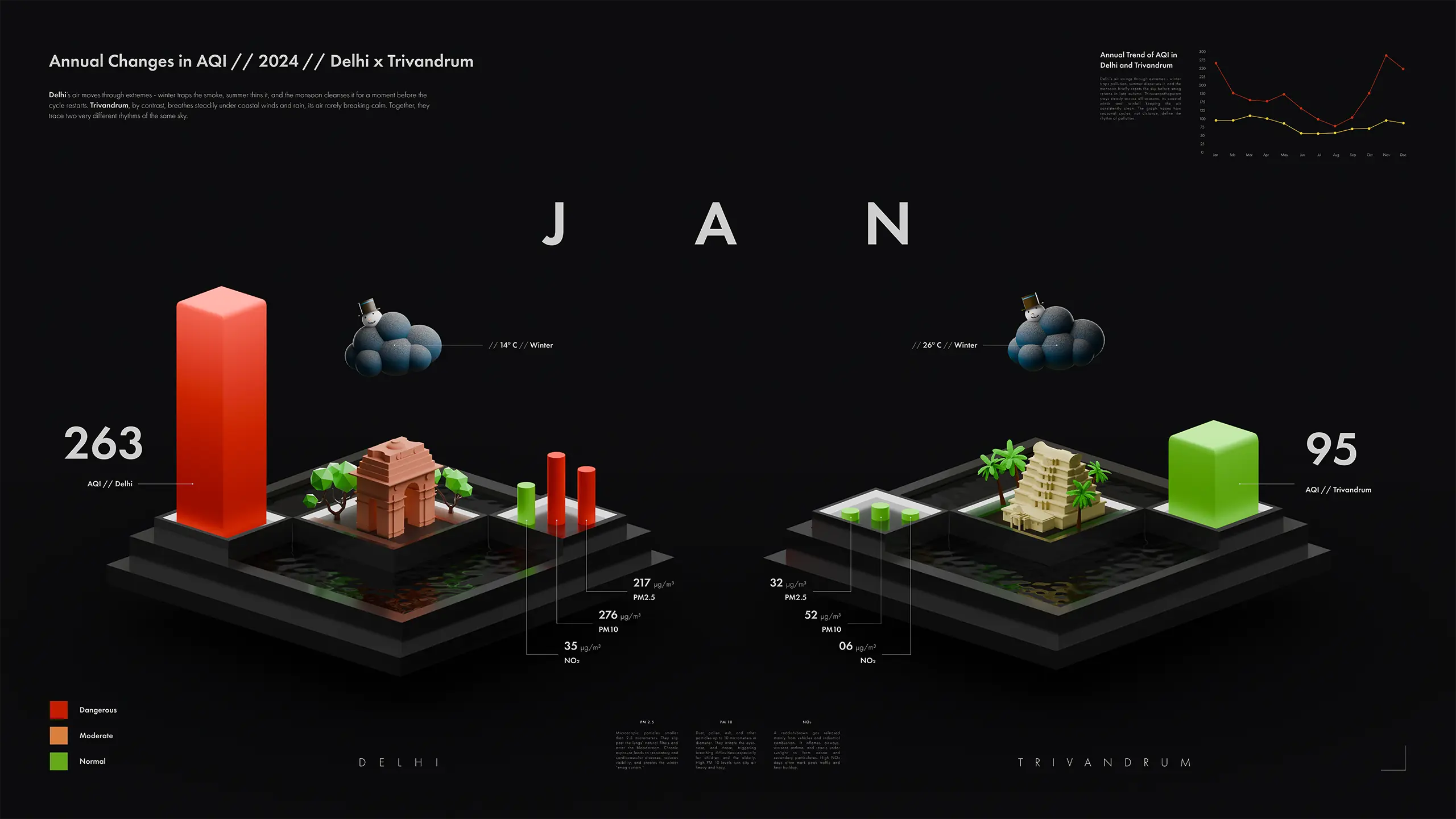
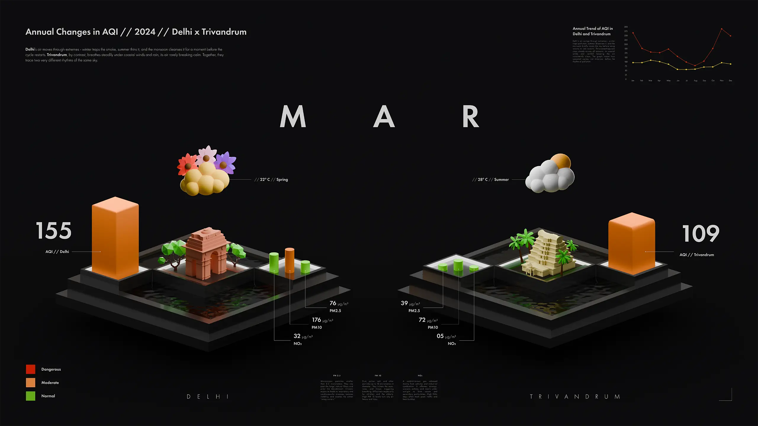
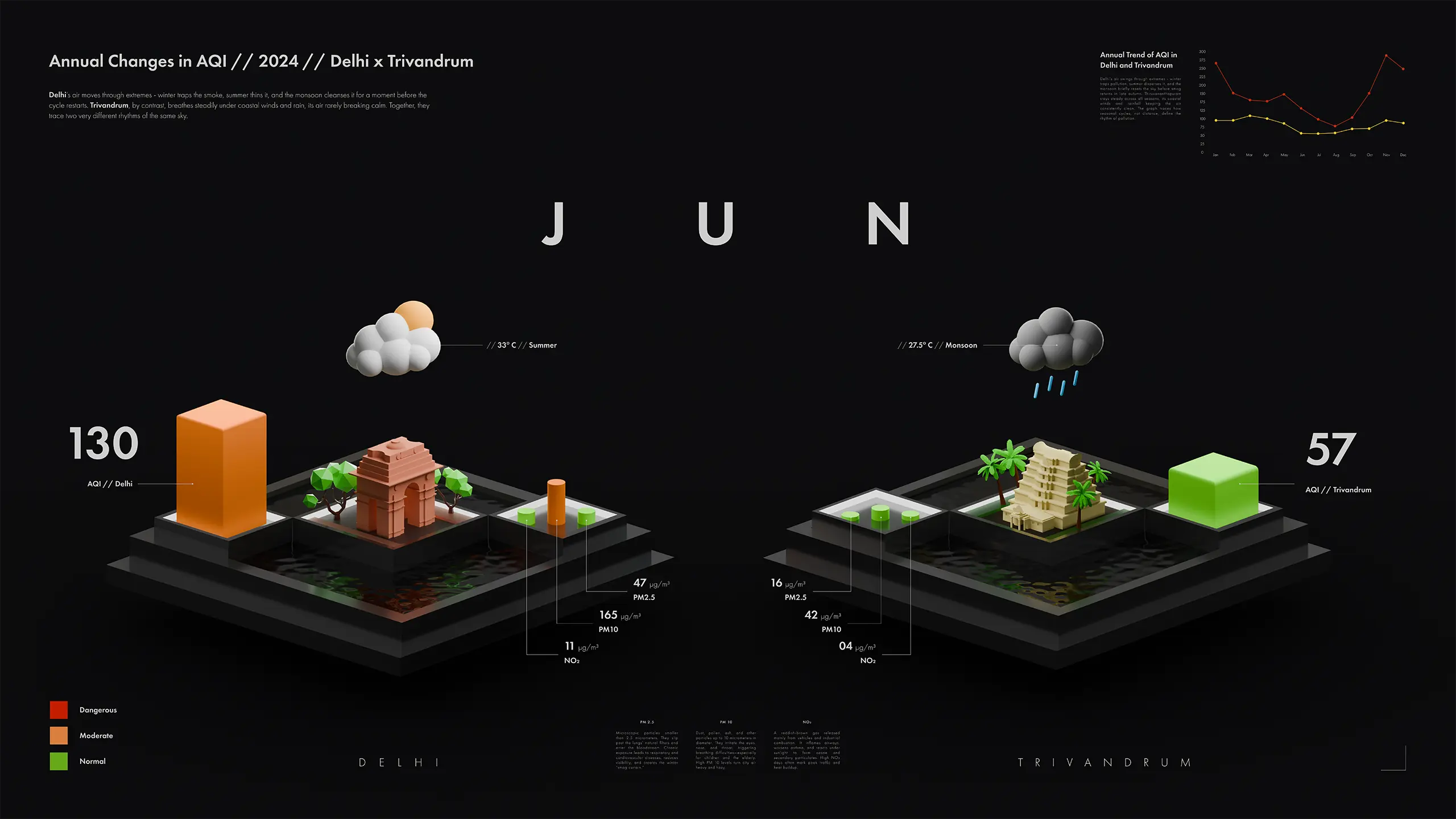
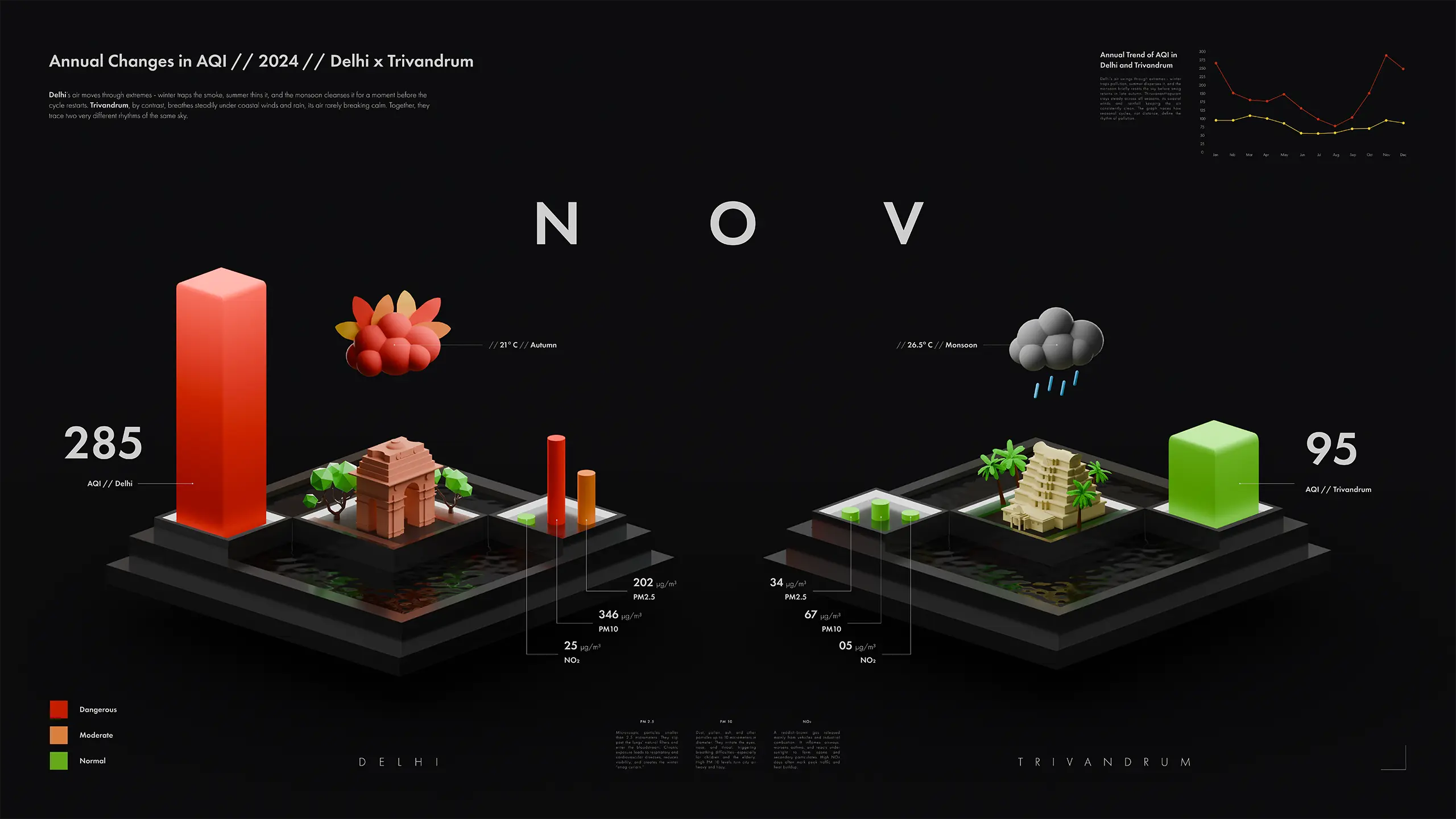
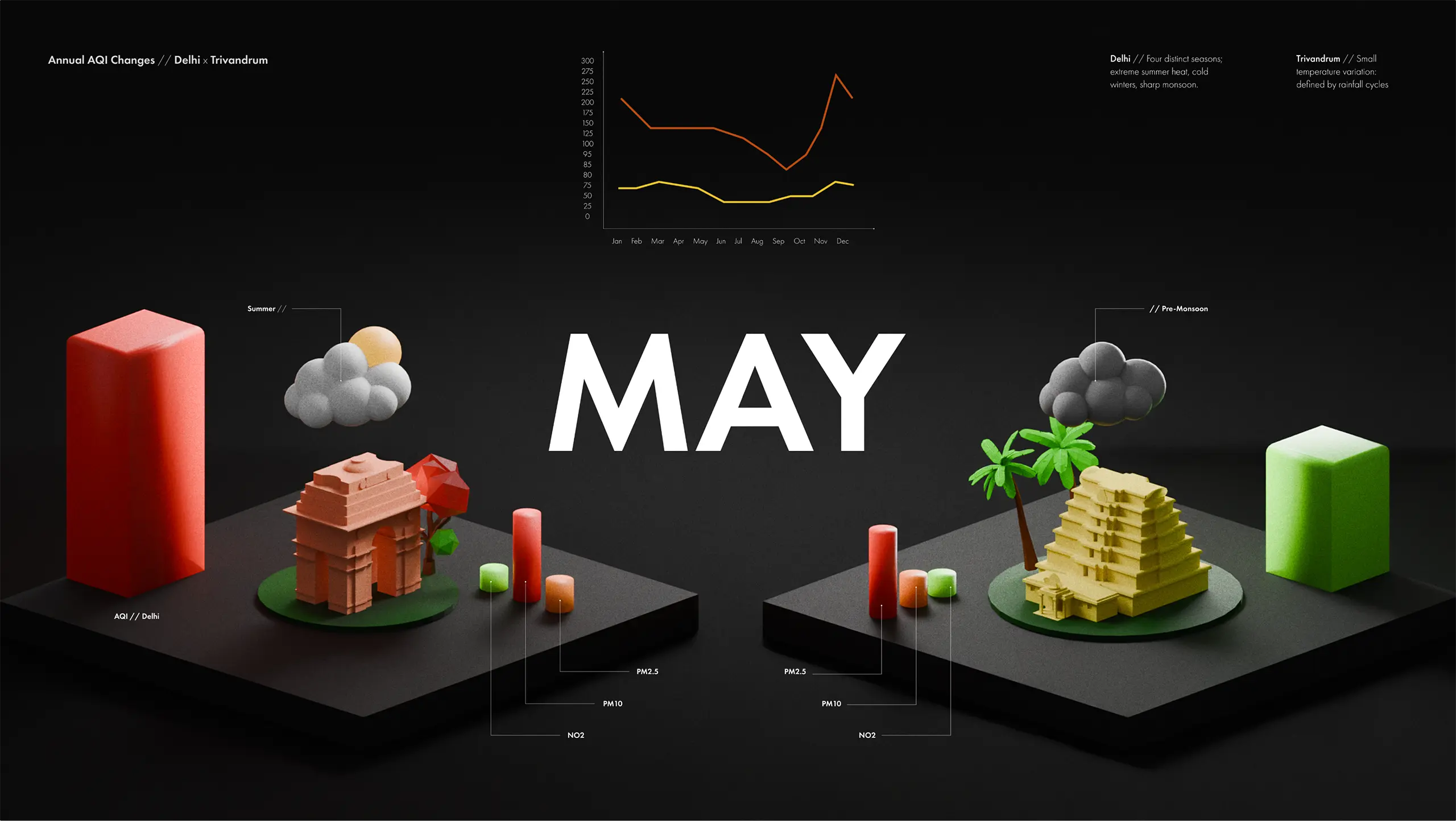
This project explores a scalable framework for visualizing urban air quality through a playful 3D orthographic data landscape. It transforms AQI and pollutant data into spatial forms, making seasonal patterns and city comparisons intuitive to explore.

(Duration)

30 Days

(Year)

2025

(Type)

Academic Project

// The Problem

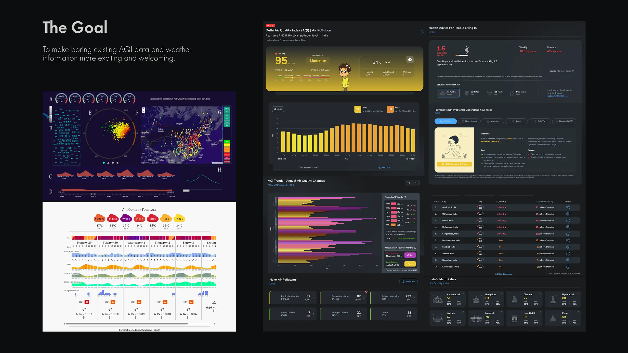
  1. Weather apps present data in ways that overwhelm rather than inform.

  2. Existing visualizations are dense, clinical, and uninviting to interact with.

// The Solution

  1. A 3D orthographic visualization that makes weather data immersive and immediately readable.

  2. The same data compressed into a single compact visual - AQI, temperature, and seasonal information unified in one design system.

  3. Location-specific visual elements ground the data in a real sense of place.
  1. A 3D orthographic visualization that makes weather data immersive and immediately readable.

  2. The same data compressed into a single compact visual - AQI, temperature, and seasonal information unified in one design system.

  3. Location-specific visual elements ground the data in a real sense of place.

(Info)

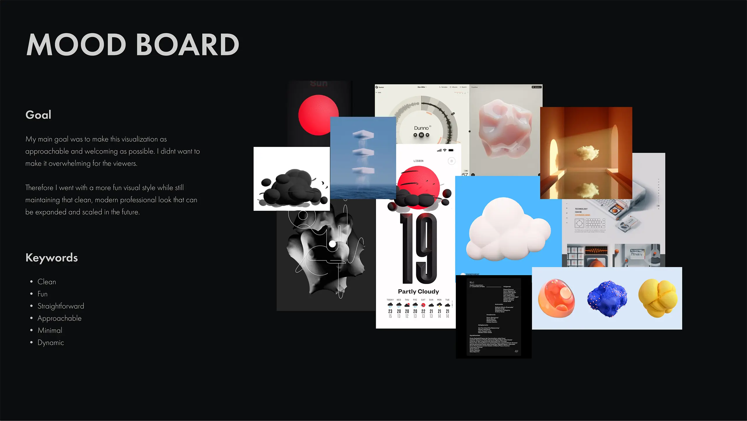
This project visualizes urban air quality using a 3D orthographic and playful visual language, transforming AQI and pollutant data into spatial elements such as height, color, and environmental cues. The goal was to move away from dense technical dashboards and create a format that feels intuitive and engaging to explore.

Designed as an exploratory experience, the system allows viewers to observe seasonal and pollutant variations at their own pace.

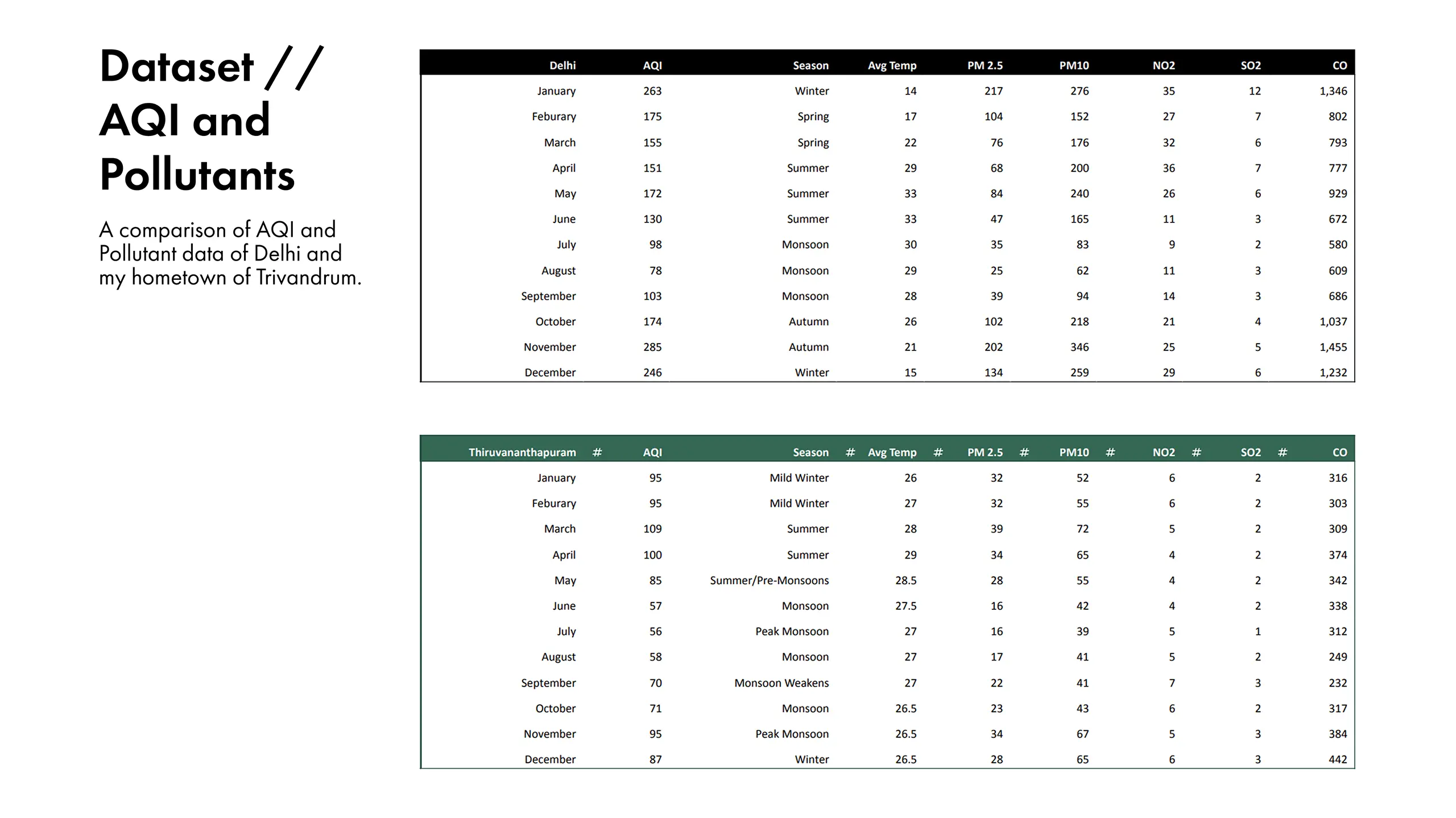
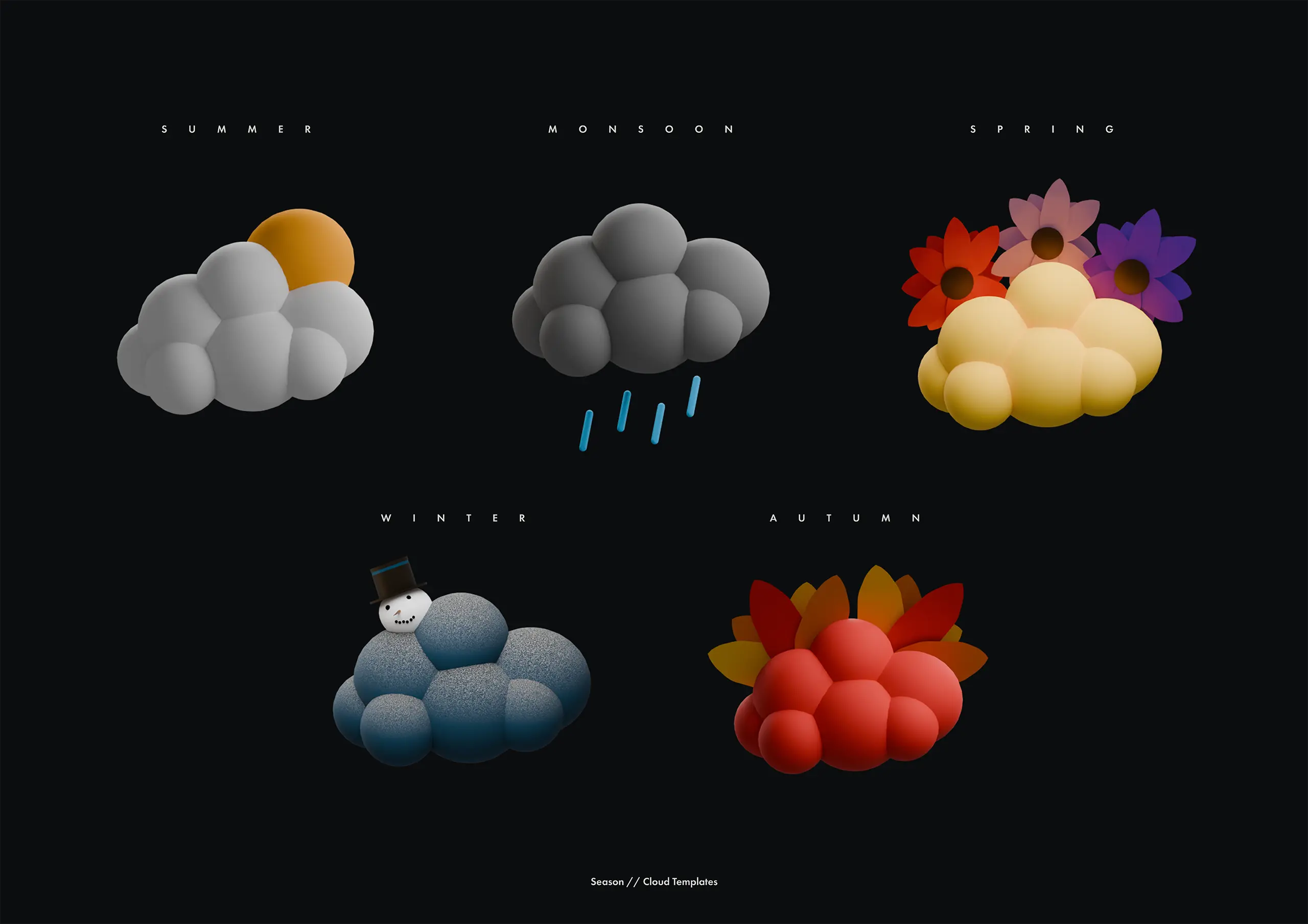
The framework is scalable and adaptable, built with modular templates for seasonal contexts and city “islands.” Delhi and Trivandrum serve as case studies, demonstrating how the system can easily adapt to different cities and environmental datasets.

(Services)

3D Modelling
3D Animation
3D Illustration

(Stack)

Figma
Blender
Adobe After Effects

(Info)

This project visualizes urban air quality using a 3D orthographic and playful visual language, transforming AQI and pollutant data into spatial elements such as height, color, and environmental cues. The goal was to move away from dense technical dashboards and create a format that feels intuitive and engaging to explore.

Designed as an exploratory experience, the system allows viewers to observe seasonal and pollutant variations at their own pace.

The framework is scalable and adaptable, built with modular templates for seasonal contexts and city “islands.” Delhi and Trivandrum serve as case studies, demonstrating how the system can easily adapt to different cities and environmental datasets.

(Services)

3D Modelling
3D Animation
3D Illustration

(Stack)

Figma
Blender
Adobe After Effects
(Animation Preview)

01 // Overview

02 // Design

(Cloud presets that adapt to different seasons)

03 // Evolution of Idea

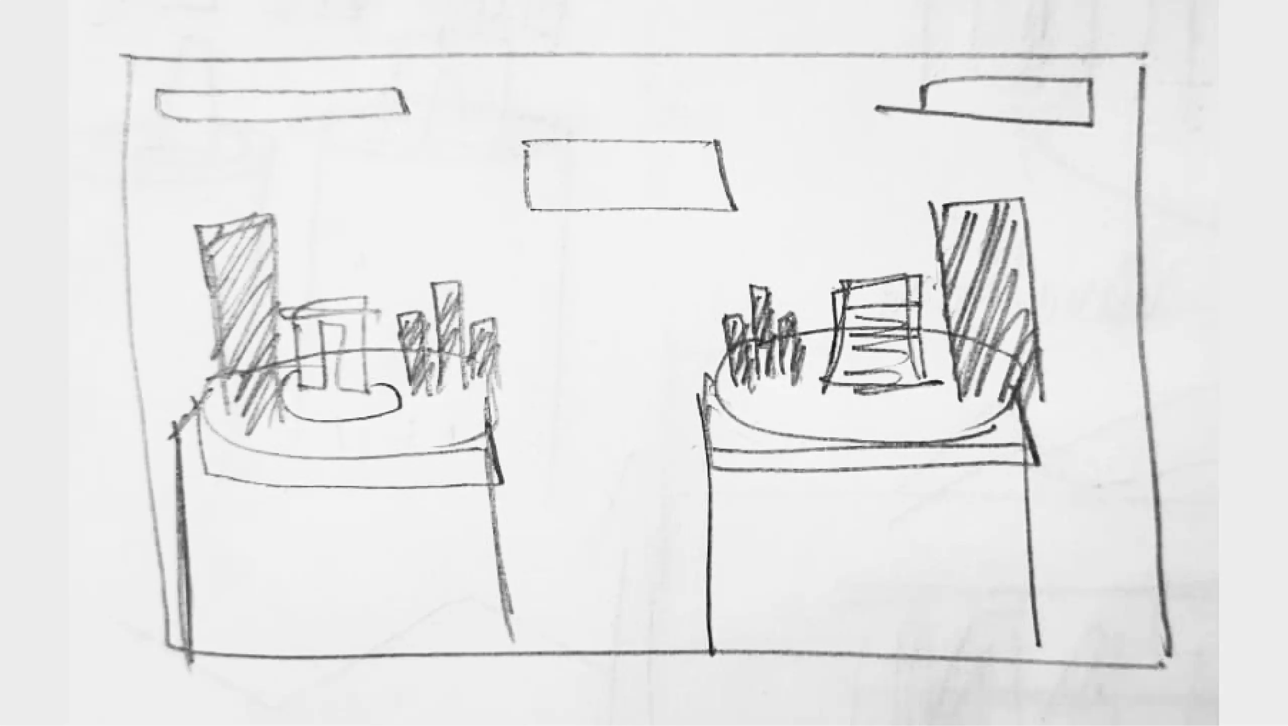
(Quick Sketch)
(Blockout)
(Final Polished Render)
//

//

More Design Projects

More Design Projects

Through The Four Rings

(Publication)

Tomato Genesis

(NFT Design)
Boundless

(Brand Identity)

Like what you see?
let's create something!